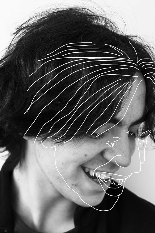
Smile
Artist Statement:
With this photo, I wanted to maintain the joy and happiness in the photo with the additional lines and drawing. Originally, this photo was in color with the drawing. I decided against this was the colors were too bright and were also distracting from the impact of the smile seen in the drawing and in the main photo too.
With this photo, I wanted to maintain the joy and happiness in the photo with the additional lines and drawing. Originally, this photo was in color with the drawing. I decided against this was the colors were too bright and were also distracting from the impact of the smile seen in the drawing and in the main photo too.
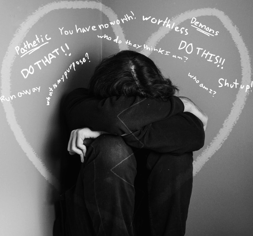
Inner Voices
Artist Statement:
This photo was painful to edit however I am very happy with the result. Being that the subject was hiding in their hands, I wanted to have a series of sayings and threats almost being "yelled" at the subject. This all worked and looked great but the image was missing something overall. This is when I added the overlay of the cracked heart. This heart not only keeps the viewers eyes on the subject but also adds to the story of the frame and adds context to all the "shouting" seen right by the subject.
This photo was painful to edit however I am very happy with the result. Being that the subject was hiding in their hands, I wanted to have a series of sayings and threats almost being "yelled" at the subject. This all worked and looked great but the image was missing something overall. This is when I added the overlay of the cracked heart. This heart not only keeps the viewers eyes on the subject but also adds to the story of the frame and adds context to all the "shouting" seen right by the subject.
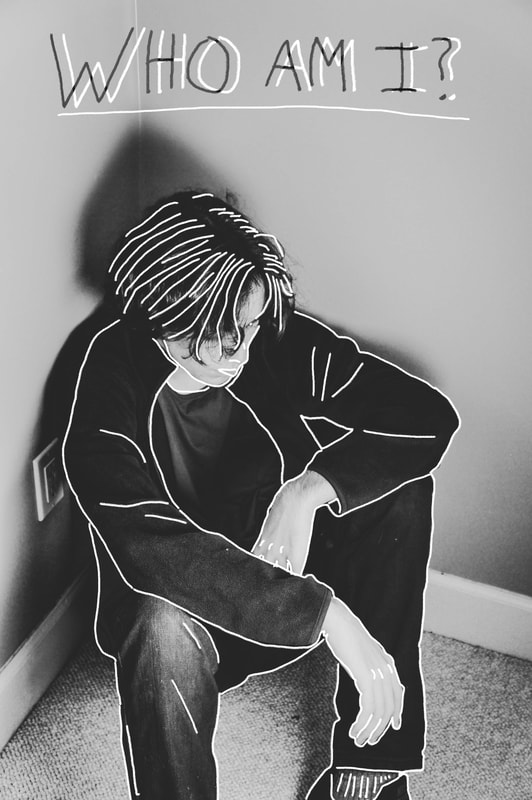
Who am I?
Artist Statement:
This photo is one of my favorites. The outline is only there to add detail to certain parts of the subject. Thus, making the emotion and reflection seen in the subject more forward. Finally, the addition of the "who am I?" tied the piece together as it added to the story of the frame. In addition, the words have a story of their own with their dual-tone design in contrast with the already black and white picture.
This photo is one of my favorites. The outline is only there to add detail to certain parts of the subject. Thus, making the emotion and reflection seen in the subject more forward. Finally, the addition of the "who am I?" tied the piece together as it added to the story of the frame. In addition, the words have a story of their own with their dual-tone design in contrast with the already black and white picture.
